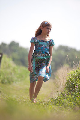
Maybe you know the drill by now.. Here is the SOOC shot.

Here's my fix.
- I cropped and rotated just a tad cuz I felt like the girl was falling over.
- Then I ran the Sunshine Action from Pioneer Woman
- Ran PW's Boost action too. That created the feel that I wanted but now to tackle the boring sky.
- I need to preface with I had no idea what I was doing and probably had no business with this effect since I didn't and still don't really understand it. But I went to Filter>Render>Cloud Difference which put a bunch of dark splotchy patches all over the picture.
- I created a layers mask to leave the splotches only in the sky and then
- I did a gradient layer to give the splotches the color I wanted and
- Set blending mode to color.
- Then I played with a kinda funky border by using new brushes I downloaded
- And finished it off with a quick boost using Unsharp Mask (Amount- 20%, Pixels- 80) and brought down the opacity a touch.
Have a great weekend!


4 comments:
Chey,
I looked at several other Iheartfaces entries none of the ones I looked at did anything much with the sky. I like what you did with the sky and I like her straightened up a lot better. I like what you did!!!
Im going through every edit posted.. just cause its my first time doing this, and after I posted mine, i was curious what everyone else did! :) I am close to the end, and I have to say Ive only commented on my fav edits. Your my 4th comment!
I did see several edits adding clouds to the sky, and straighten the girl up. But I like how subtle yours looks, very natural blending well with the rest of the photo.
I also love the decorative textured border you added. So pretty! Its also very subtle, which I like. it just adds a little bit of whimsy to the photo. Love it! Very creative.
Youre like in the 90's on the list, and I have seen so many edits that are so similar. Youres really popped out to me. Great job!
This is great Cheyenne. I need to read that I heart faces page. Every time I open photoshop I feel like I'm yelling at it "I know you can do this, why won't you let me!"
The more I look at your makeover, the more feeling I see in the picture. Compared to the before, your editing has enhanced expression and depth of character of this young girl. I love it even more.
Post a Comment