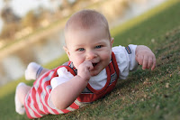
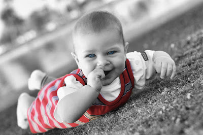
 This one was my first attempt. I made it black and white, then pulled out the onsie to keep it's color. I then decided that I wanted to try to just paint in Riley's eyes and make them blue (which they are blue but I intensified the color)
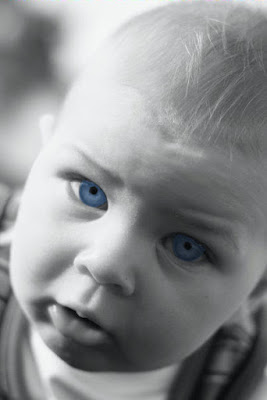
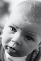 This one I started from a black and white photo. Since it started b&w, I had to add color. It was a little more complicated than I anticipated. I had to do each eye separately because when I tried to do them together on a layer, it looked really unnatural since his left eye is more shadowed than the right. I basically created a painting on a separate layer and then adjusted the opacity until it looked okay.
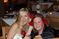
This one was a little trickier. I did two separate effects.. Obviously I pulled out the red in the roses. I chose to only highlight the three by the faces because I had the forth one done and it just didn't look good. I also adjusted the depth of field so there is a blur in the background and the faces are clear!

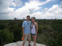 This is what I was talking about with the revelation that I had. It may seem simple to everyone else, but I tried to do something like this before and failed miserably. I don't' know if you can tell, but everything is kind of with a wind blown effect of sorts and then I knocked out a couple spots that I didn't want the distortion to be present. I still need to work on this one a little, but I understand the concept which is the first step!
Now I've got to get off... My husband just tackled me to the ground and reminded me that it's March in Phoenix with beautiful 80 degree weather... I should be outside enjoying it!!!

6 comments:
One thing that may help and save you time:
Take the same picture and create multiple layers of. For example that picture of you and Cougar:
You have the normal pic at the very bottom... the next layer is the same pic but blurred. Now just take the eraser to the TOP layer of the stuff you don't want blurred... a LOT easier and less time consuming than using the "cutting" tool.......
Sounds like your tutorial is living and breathing! I know you're looking for 'artistic license', but I do like the clearer picture in this case. Is there something wrong with my eyes? Actually, you're doing great... soon, you'll be TEACHING the class!!! :)
The 'word verification' for me is 'asoroat' ... it sounds like Xerxes real name!!!
PS: Riley's blue blue eyes are awesome!!! I especially loved that one!!!
Good work!!
You are going to take over the world with your Paint Shop skills!
So much fun! =)
Love the pics..we got the same camera last oct and have been lov lov loving it!!
Post a Comment